
The four paintings below were chosen by a jury of three professionals in the art world. More about the judges here.
First Prize “Orchard Beach” by Denise Antaya (Sutherland)
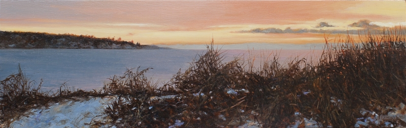
Judges’ comments:
- effective texture and light in the foreground
- depth created from the clever positioning of sunset and lake
- clever composition
- good use of contrasting colours
- compelling use of colour
- vibrant peach/pink tones captured
- artistic control with some welcome looseness
Second Prize “January Morning -24C, Goderich” by Michele Miller
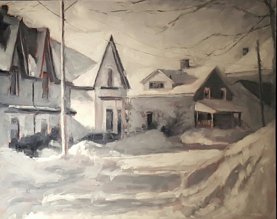
Judges’ comments:
- undertones with the grey rendering give depth
- look at the roof lines, especially where they meld with the sky to effect subtle demarcation
- orange underpainting creates vibrancy
- some delightful “painterly passages” – which means artist is not afraid to show brushwork
- overall, simple but effective.
1st Honourable Mention “October” by Elizabeth Carr
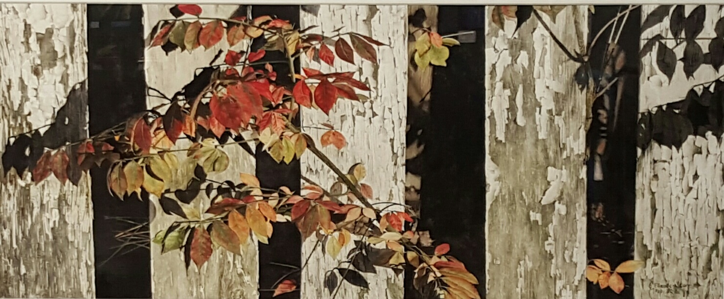
Judges’ comments:
- effective texture
- interesting composition with use of light and shadow
- almost photographic sense of detail
- the dominant vertical trunkscape with the sideways swoosh of leaves and colour produce a sense of rhythm, balance, and contrast.
This Carr painting also won the cash award for Watercolour Choice listed below.
2nd Honourable Mention “Bottles” by Laura Jones Wright

Judges’ comments:
- there’s a rhythm and depth created by the play between light and dark, the contrast between
- reflection and shadow
- evocative of small town Ontario dusty general store
The 5 paintings below were chosen by sponsors, including individual, group, and and corporate.
Oil/acrylic Choice (in memory of Rosemarie Crosswell) “By the Light of the Dodge” by Janice Innocente
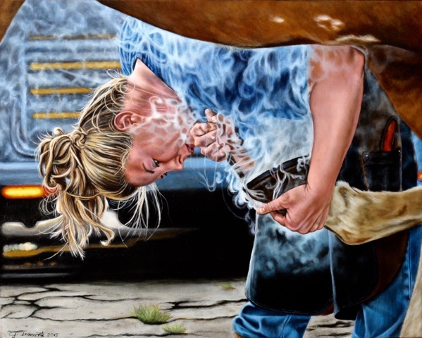
Chooser’s comments: My daughter Candice and I, in choosing a painting in memory of my mother, wanted it to be something she would have liked. For us technical skill was as important as the subject. This work has creative composition and skill. Candice said Gramma would have really liked this one.
Watercolour Choice (in memory of Tom Crossman) “October” by Elizabeth Carr
Chooser’s Comments: This was chosen due to its clean, refreshing composition and excellent, crisp execution. The extended horizontal design is somewhat unusual for a watercolour, and the artist has carried it off very well. The painting is a standout.
Wildlife Choice (sponsored by Hay Communications) “Broken Silence” by Ken Jackson
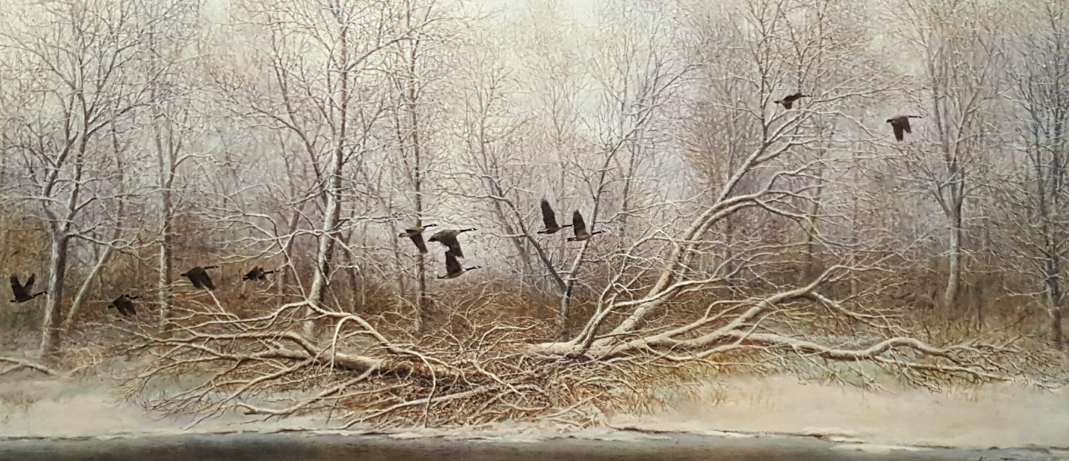
Choosers’ Comments: Even before we got close enough to read the title of this painting, we could hear the recognizable symphony this majestic flock of geese creates on take-off. The title says it all: Broken Silence. This splendid wildlife moment is captured in colour and movement. We admired the detail in the beaks of the magnificent birds and the way the scenery was depicted.
Waterscape Choice (sponsored by the Rotary Club of Grand Bend) “Remember When” by Chris Morton
Choosers’ Comments: There are a number of outstanding waterscapes in the show. This was chosen because it is very painterly in style, does not look like it was painted from a photograph, and has strong impressionistic qualities while at the same time being distinguished fine art with an exquisite asymmetric natural balance of colours, tints, and tones typically found on the shores and across the horizons at many Ontario locations.
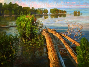
Calendar Cover Choice (sponsored Commercial Print-Craft) “Remember When” by Chris Morton
The soft beauty, when seen at a distance, allows the painting to be admired in many different settings of lighting and background. The work reminds us of how light on water stimulates the human senses in almost mystical ways. Some images exude quality and this one has a sufficiently long list of artistic merits.
This painting also won the
Calendar Cover Choice (sponsored by Commercial Print-Craft)
Chooser’s Comment: This is a stunning painting. A view that could be found in many parts of Ontario, it is unique in the beautiful light portrayed, brilliant use of colour, a playful painting style, and solid composition. This painting will draw attention in any room.
When entering the competition, artists stipulate if they want a piece to be considered for a purchase award. Winners sell the painting, regardless of posted price, for $500; the usual commission is waived.
Founder’s Award “Centre Wellington Field Patterns # 3” by Dick Marvin
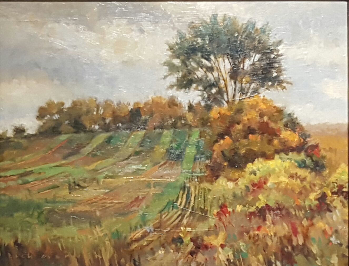
Chooser’s Comment: This superior oil painting is executed beautifully. One is drawn to its strong use of colour and to the way the artist expresses the beauty of a simple rural environment. This is a great addition to our permanent collection.
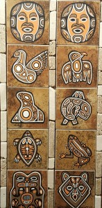
Mayor’s Award “Baby Animal Spirit Guides” by Michael J. Billett
Chooser’s Comment: This year’s selection uses an unusual medium of acrylic on tile which is then surrounded by natural stone. The subject matter and symbolism remind us of the diversity of this area (Lambton Shores) and its people. The artist’s connection to nature and to Aboriginal culture makes this a perfect addition to the municipality’s growing collection.